Have you ever uploaded an image to your website only to find it looking fuzzy or pixelated? This can happen for a few reasons, but is generally an issue of image quality or screen resolution. Now, this may not be of much concern to you, but with today’s competitive marketplace, first impressions are everything.
Low quality imagery will diminish your website’s user experience and visitors may start to assume other conclusions about your business. For example, users may find your site untrustworthy, assume carelessness in other areas of your business, consider your business unprofessional, among many others. In order to avoid this, you need to keep your website imagery sharp. This may be easier said than done, but here’s how to keep your images looking crisp on all devices.
Image Integrity
Image integrity is of crucial importance. If an image is low quality or has been deformed in any way, your presentation may suffer. So, it’s important to remain vigilant when selecting and editing your imagery. We’ll start with the most important consideration, which is image quality.
Image Quailty
Image quality is number one. There is a saying that goes, “garbage in, garbage out”, and if your images aren’t good in the first place, they won’t be good on your website. Now, photography is out of scope for this article, but you need to consider such things as lighting, contrast, white balance, framing, etc. If you don’t do your own photography, it’s important to understand these things so you can develop an eye for quality. Luckily, there are plenty of stock photo websites that provide beautiful imagery at a decent price. One of my favorite stock photo websites is pixabay because it’s free!
Image Size
Whenever possible, start with the largest/highest quality image you can obtain. You can always scale an image down, but you should never try to scale an image beyond its original size. Doing so will cause the image to become pixelated and grainy. Yes, you can get away with a slight increase, but I would not go much further than 10%.
Aspect Ratio
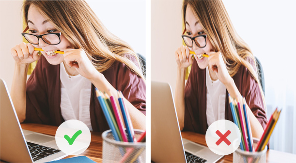
Aspect ratio is another very important consideration. When scaling an image up or down, it’s imperative that it’s done while preserving the aspect ratio. This means both width and height are scaled equally. Below is an example of an image scaled while preserving the aspect ratio and another that does not.

Notice how the image on the right looks kind of stretched/squished and is of lesser quality? This is what happens when an image does not preserve its aspect ratio. So an image that’s 600 x 400 scaled down needs to be something like 300 x 200. Lock in that aspect ratio and you’ll have no problems.
Screen Resolution
Around 2012, Apple presented their next generation MacBook Pro with “retina” screen technology. This essentially doubled the amount of pixels on screen from 1440 x 900 to 2880 x 1800. This made text and code based designs look extremely sharp and pleasant to look at. Images on the other hand, were essentially doubled in size and lost quality. It’s an issue that’s still prevalent today, but there are now a number of ways around it. First, let’s cover a few of the basics of screen resolution.
Screen vs Print
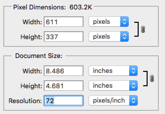
When saving or exporting images from editing software, it’s important to take into account image resolution. Images meant for screen use should be saved at 72ppi (pixels per inch). This has potential to cause issues, so be sure to save all imagery at 72ppi; I included a screenshot below highlighting the resolution.

On the other hand, if you ever need an image printed, your resolution should be 300dpi (dots per inch). This exports a higher quality image that prints sharply. Printing at a resolution of 72ppi will cause your images to appear blurry and low quality. As an online business, you may not deal with printed material, but I thought it was worth mentioning.
Multiple Resolutions
Since Apple released their retina screen at twice the standard resolution, the market has flooded with similar devices. These devices are presented as 1.5x, 2x, and 3x times standard resolution. 1.5x and 2x are seen mostly on computer screens and phones, while 3x is seen mostly on smart phones. Don’t let these multiple resolutions become a burden, just know they are out there and try to cover what’s reasonable.
Possible Solutions
There are quite a number of solutions to this problem and you’ll have to decide what’s best for you. Here are a few options to get your images looking sharper.
Double Up
One solution to this problem is to create imagery twice the size of what you need and define the image dimensions in your code. For example, let’s say you need an image at 600 x 400. You would create the image at twice that size for 2x, 1200 x 800, and upload that to your website with fixed dimensions. The image below shows the original dimensions on the left with retina(2x) adjusted dimensions on the right. See how I shrunk the original image to half the size? It’ll look great on retina screens.

This is a quick and easy way to cover your bases for retina screens, but there’s a catch. If you use this technique for multiple images, your page load time will slow significantly. Since all your images are much larger, it’ll take longer to load and especially on mobile devices. So, this is a great technique when used sparingly, but don’t let your page load suffer.
Srcset, sizes & picture
srcset, sizes, and picture are html/css elements that allow for greater image control. If you have access to your websites html and css, this may be a good option for you. Essentially, the browser runs through your code, encounters one of these elements and delivers the correct picture size depending the device being used. This works great for mobile devices as it will load smaller images faster.
Let’s say you’re using a computer with 2x resolution. The browser will take into account your device’s screen resolution and provide one high quality image. This ensures a good user experience in regards to image quality and load speed no matter what device is being used. If you’d like to learn more about using these elements, I’d suggest CSS-Tricks article on responsive images or the following article if you’re strictly interested in responsive resolution.
SVGs
Last but not least there are SVGs, which stand for scalable vector graphics. Now, these are not raster images, but graphics made in a vector program like Adobe’s Illustrator. What’s great about SVGs is that you don’t need to worry about image resolution, they will always remain sharp no matter what device you are using. Here’s an example of an SVG, see how sharp and crisp it is? It will remain that way whether it’s viewed on a computer, phone, tablet, TV, etc and at any resolution available.
Personally, I use SVGs whenever possible because it’s future proof and always look crisp no matter the device being used. WordPress doesn’t allow SVG uploads by default, but by installing safe SVG, you can safely use SVGs on your website.
Looking Sharp
Image quality is crucial in providing a positive user experience. A positive user experience is not only good for your users, but good for business. By using quality imagery and delivering high resolution images to capable devices, you’ll be able to compete for business with the best.
What are your thoughts, do you have any questions or thoughts on improving image quality? Leave a comment below!
*Some of the links above are affiliate links, which means that if you choose to make a purchase, I will earn a commission. This commission comes at no additional cost to you. I recommend them because they are helpful and useful, not because of the small commissions I make if you decide to buy something.


